Since the Barrierefreiheitsstärkungsgesetz (BFSG) came into force in June 2025, many of us have become familiar with accessibility. At first glance, all the rules, guidelines, and implementation options can seem overwhelming.
In this blog post, I will show how developers can take their first steps toward accessibility, with a focus on practical implementation for web applications.
Why is accessibility important for us?
The goal of accessibility can be summarized as follows: “Enabling all people to use our application without barriers.”
According to the World Health Organization, approximately 15% of the world’s population lives with a severe disability, which corresponds to over a billion people. Accessible applications not only enable this significant portion of the population to perceive the content we offer, but also improve the overall user experience. Take alternative text for images for example: people with impaired vision can use screen readers to obtain the information contained in the image, but so can anyone who is unable to load images due to a poor internet connection. Keyboard navigation is not only helpful for people with physical disabilities, but also for anyone who is temporarily unable to use a keyboard due to a broken arm.
In addition to the obvious ethical and legal aspects, there are also concrete technical incentives for designing accessible applications. For example, correctly setting a page title will also have a positive effect on making your website more visible to search engines.
Basic Principles and Guidelines
As with most things, the first step is to be aware of the requirements, or at least knowing where to find them:
Web Content Accessibility Guidelines (WCAG): The WCAG of the World Wide Web Consortium (W3C) define international standards for accessibility and are therefore the most important resource you should be familiar with.
In total, the current version 2.2 contains 13 guidelines, each of which defines different success criteria. These are divided into three levels of conformity: A, AA, and AAA. Let’s take the task of making a video accessible as an example: Providing subtitles for a pre-recorded video conforms to level A, while subtitles generated in real time for a live recording are AA. To achieve level AAA, it is necessary to provide a complete text alternative for all visual and auditory events in the video. For many applications, it is not realistic to meet all AAA requirements, but of course, the more criteria that are met, the better.
Incidentally, the BFSG also follows the WCAG and expects compliance with the requirements in Level A and AA – so you should aim for at least Level AA.
How to
Semantic HTML
The good news is that native HTML is inherently accessible when used correctly. Specifically, you should build your web application’s layout using semantic HTML.
What does that mean? Of course, it is possible to write a good-looking and functional application using only <div> s, CSS, and JavaScript. However, this would pose a major obstacle for users of assistive technologies (ATs) like screenreaders.
ATs access the so-called accessibility tree to pass on information to the user. This tree is created by the browser and contains the name, description, role, and status for each element. A checkbox could therefore have the name “Yes,” the description “Approve advertising consent,” the role “checkbox,” and the status “checked.”
Non-semantic elements such as <div> and <span>, on the other hand, do not contain any of this information.
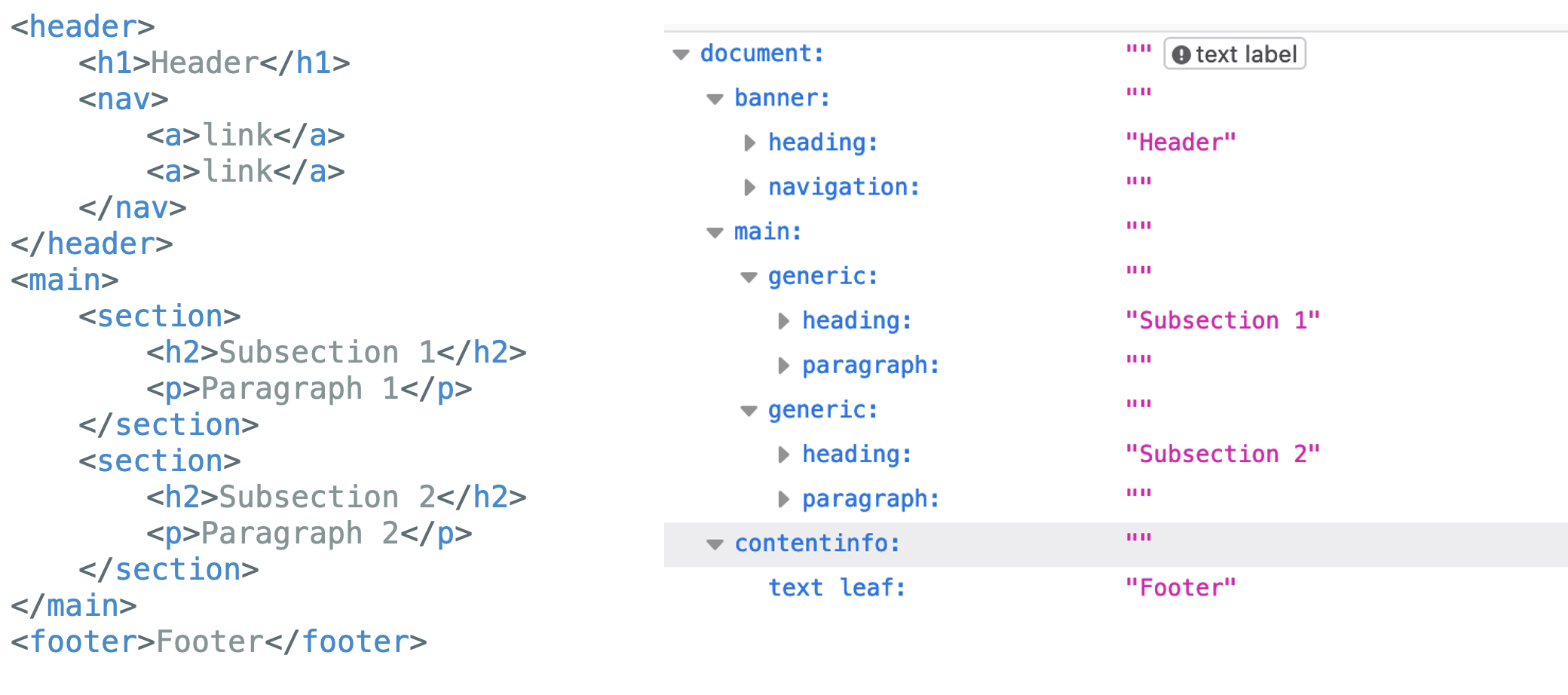
For comparison: This is what a well-formed accessibility tree looks like. The AT can distinguish between sections and recognizes landmarks like the header. footers, and navigation. This enables blind users to navigate within the application.

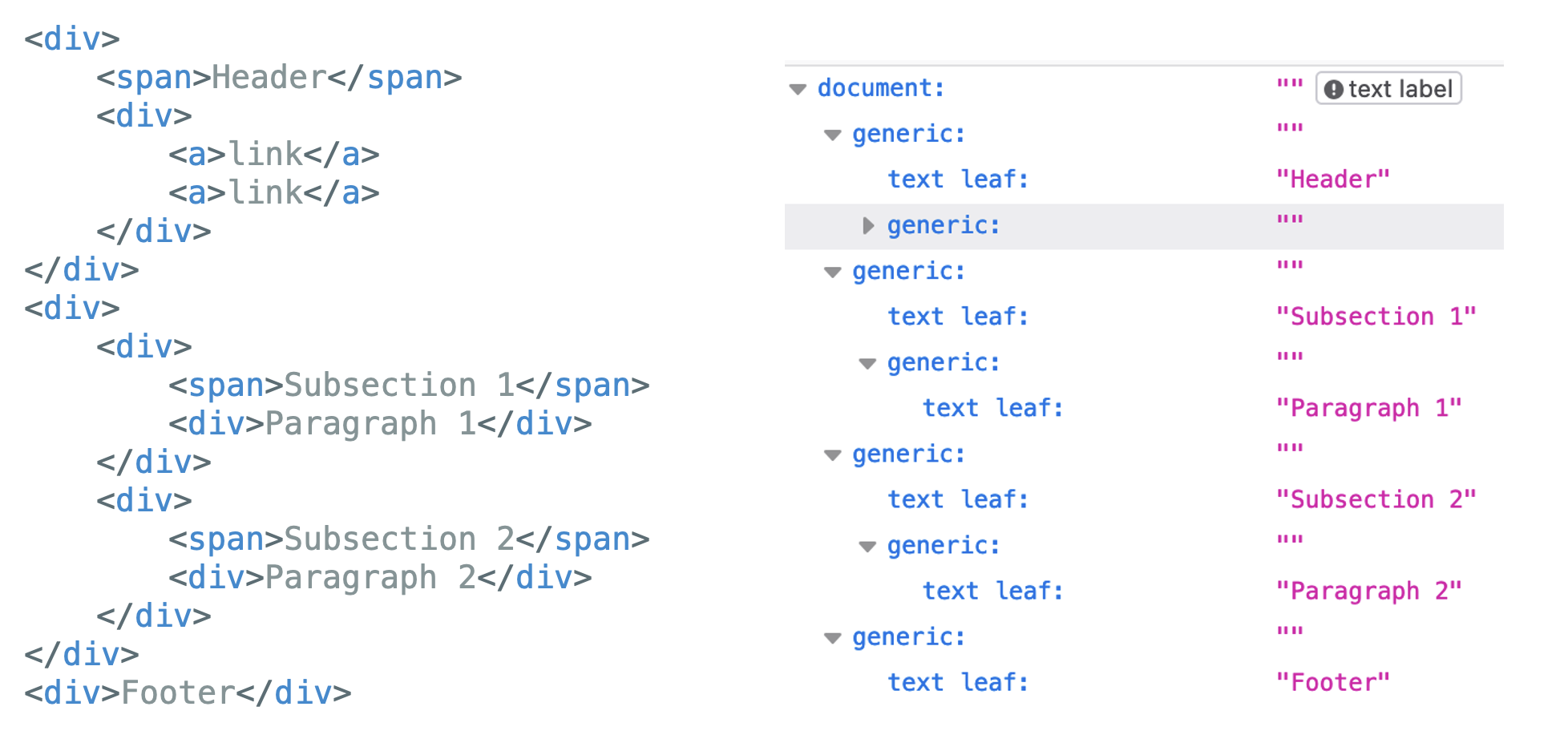
If, on the other hand, almost exclusively non-semantic elements were used,the accessibility tree looks like this: This tree provides much less information—apart from the basic hierarchy, almost nothing is passed on to the user. A screen reader, for example, will read the entire text in one go instead of pausing appropriately after each paragraph.

In short: If possible, use semantic HTML elements! In most cases, this is enough to make a piece of content already much more accessible.
Do:
<p>This is an example for a <a href="https://www.anotherpage.com">link to another page</a>in a text block.</p>
Do not:
<p>This is an example for a <span class=“myLinkStyle” onclick=(openLink)>link to another page</a>in a text block.</p>
However, if native HTML should not be sufficient for your use case, it is possible to use ARIA attributes.
Web Accessibility Initiative: Accessible Rich Internet Applications (WAI-ARIA):
WAI-ARIA provides technical specifications that can be used to define the role, status, and other properties of web elements. This only affects the accessibility tree, not the elements themselves!
States and Properties (Attributes)
States define the current state of elements, which can change over the course of the application’s lifecycle. In relation to elements/widgets, they are usually quite self-explanatory, such as aria-required or aria-readonly.
There are also attributes that describe the relationship between elements, such as aria-describedby or aria-controls. It is important to ensure that the attributes do not cancel each other out:
<button aria-label="Blue" aria-labelledby="color">Red</button>
<span id="color">Yellow</span>
In this example, aria-labelledby has the highest priority over both aria-label “Blue” and the button text “Red”. A screen reader would therefore read the button as “Yellow.”
Roles
The most important information set via roles is what an element is or does (so-called widget roles) or how it fits into the page structure (structural roles).
For example, if a button is to be displayed in an application, these three lines are essentially equivalent from the perspective of a screen reader:
<div role="button">Submit documents</div>
<button>Submit documents</button>
<input type="button" value="Submit documents"/>
When a role is assigned, the user will assume that the behavior associated with this role has also been implemented. role=”button” thus informs the user that clicking on the button will actually submit the document. Some roles also require ARIA states to be exist: role="checkbox" cannot exist without simultaneously setting aria-checked.
While most roles add semantic information, there is one exception: the “presentation” role removes all semantic properties of an element so that screen readers skip the element completely.
Structural roles, as the name suggests, provide structural elements such as “heading”, but also elements for which there is no equivalent in HTML (yet), such as “tooltip”. Landmark roles can be used to create landmark regions, but they are equivalent to semantic HTML elements: <div role=”banner”></div> corresponds to <header></header>.
In general, there are suitable HTML replacements for many roles, especially structural roles, which should be preferred instead: instead of setting role=”button” or role=”list”, <button> or <ol>/<ul> should be used directly.
Defining Live Regions
With “aria-live”, you can create so-called live regions, for example sections of the application that can be updated after the initial loading of the page. ATs buffer the content during loading; so if, for example, a notification appears later, the user would not notice it without aria-live= “polite” means that the change is low priority, while a change with “assertive” interrupts the screen reader’s current action. Alternatively, role=”alert” could also be used, which would correspond to aria-live=“assertive”.
<div aria-live="polite">...</div>
<div aria-live=”assertive">...</div>
<div role=”alert ">...</div>
With ARIA, we can assign semantic meanings to elements beyond the HTML properties themselves.
However, caution should be exercised when using it: it is not without reason that WAI warns “No ARIA is better than bad ARIA.” Users must be able to rely on ARIA attributes to make correct statements without exception. As shown in the examples, developers should be aware of the exact meaning of the attribute before deciding to use it.
For more information and a collection of all available attributes, I personally recommend the documentation from MDN Web Docs.
With these basics in mind, we can now take a closer look at some specific WCAG guidelines. However, the following aspects are not representing the complete criteria, but are merely intended to serve as an introduction to the topic.
Introduction to WCAG criteria
The W3C divides the requirements into four main principles:
Perceivable
The information presented must be equally perceivable for all users, even if they use assistive technologies.
Provide text alternatives for non-text content such as images, icons, audio, etc.
- What information is relevant for the user? If images are purely decorative, it is better to use
alt="", so screen readers will skip the element completely. - Convey the semantic instead of the literal meaning: When describing the icon in a search bar, use “search” instead of “magnifying glass”
- alternatives for time-based information as well: Provide captions for videos and audio recordings
Content should also be distinguishable: Users should be able to easily distinguish foreground elements from background elements, even if they have visual impairments
- Colors
- Contrast to the background needs to be at least 3:1 for non-text elements. The contrast is calculated using the relative luminance of both the background and the foreground color; the easiest way to check it is to use a tool like WebAIMs color checker.
- Never use colors alone to communicate something to the user – e.g., a link should always have text decoration instead of just color differences, errors should not be indicated only by a red border. A colorblind user would potentially not recognize the link in the second sentence:
This is a link (but not really).
This is a link (but not really).
- Text
- It must be possible to resize the font size and spacing without cutting off the text => do not use set heights; do not set
user-scalable=”no”in your<html>tag as this prevents zooming - Contrast to the background needs to be at least 4.5:1
- It must be possible to resize the font size and spacing without cutting off the text => do not use set heights; do not set
- Customizable: Content should be displayable in different ways without losing information or structure.
Your content should also be adaptable. This means users can view it in different ways without losing information or structures.
- The order of the content should be made clear through use of the correct HTML elements: a screen reader should recognize the same sequence as a seeing user
- All relationships and elements need to be programmatically determinable and need to be clearly labelled
Do:
<label for=”nameInput”>Name:</label>

<input id="nameInput"/>
Do not:
<span>Name:</span>
<input/>
Operable
The application and interactive UI components must be operable by the user.
The entire content should be keyboard accessible. This means your entire application needs to be able to be used with purely the keyboard and the previous criteria must all be fulfilled for keyboard users as well: Important to avoid are focus-traps: If you can focus an element with the keyboard, you also need to be able to move away from that element.
If you create custom elements with their own event handler, avoid mouse-specific event and use device-independent handlers instead:
Do:
<div role="button" onClick="download()">

Click me!

</div>
Do not:
<div role="button" mouseDown="download()">
Click me!
</div>
Users have to able to handle time-based content. If you display anything for a set amount of time, you should give users the option to extend, adjust or even turn off the time-limit. Any moving, blinking, scrolling or consistently updating content should also be able to be paused, stopped or hidden, unless it is essential to the functionality. For example, a loading spinner can be seen as essential if the user can not interact with the rest of the application in the meantime.
Your content also needs to be navigable. Users should have ways to determine where they are and where to find content.
An important aspect of that is focus: An interactive element has to be focusable and vice-versa. If the element is focused, this needs to be visually indicated, for example via setting a border. A focused element also is not allowed to be entirely hidden.
The focus order has to be meaningful: using tab to navigate should result in a logical sequence. To achieve this, avoid setting custom tabindices on your UI, so the tab order naturally follows the order of the markup elements in the DOM.
The destination of links, no matter if within your page or leading to outside, should be clear; either by the link text itself or by the surrounding text.
Do:
<a href="guidelines.html">Read the guidelines here</a>
Do not:
<a href="guidelines.html">Click here</a>
Understandable
The guidelines in this category state that the information presented and how to use the UI must be intuitively understandable—many of these requirements also correspond to basic UX principles and should be applied for that reason alone: In order to make your application more readable, use simple language and most importantly, set the lang attribute in the <html> tag, so ATs know in which language to interpret the page.
<html lang=”de”>…</html>Consistent UI and action design leads to an predictable application. For example, use the same button styling for the same action.
The user must also know what inputs are expected, which inputs are incorrect, and how to correct errors. It is your job to provide input assistance:
- If you set a password: Instead of the error message “Invalid password,” use “The password must be at least eight characters long and contain a number and a special character.”
Robust
Robust essentially means that the application must be usable by a wide range of user agents, including assistive technologies. Specifically, this means that the name, role, and status of elements can be determined or set programmatically, and users are notified of changes on the interface. These criteria are usually already met through the correct use of semantic HTML and, if necessary, ARIA.
Testing Accessibility
First of all: It is impossible to ensure accessibility without manual testing. Ideally, this should be done by groups of experts or even people with disabilities themselves, because no one can provide better feedback than those who use the features.
However, if this is not possible for budgetary or availability reasons, testing and evaluation can at least be supported by numerous tools, even if this does not guarantee accessibility.
W3C offers an uncurated list of available tools for evaluating both web and mobile applications. From these, you can select the right tool for your purposes, whether as CI support during development or a browser plugin for later evaluation.
At this point, however, I would like to introduce a few tools based on the W3C homepage that the average user is sure to already have access to—namely, the browser dev tools in most major browsers.
Lighthouse
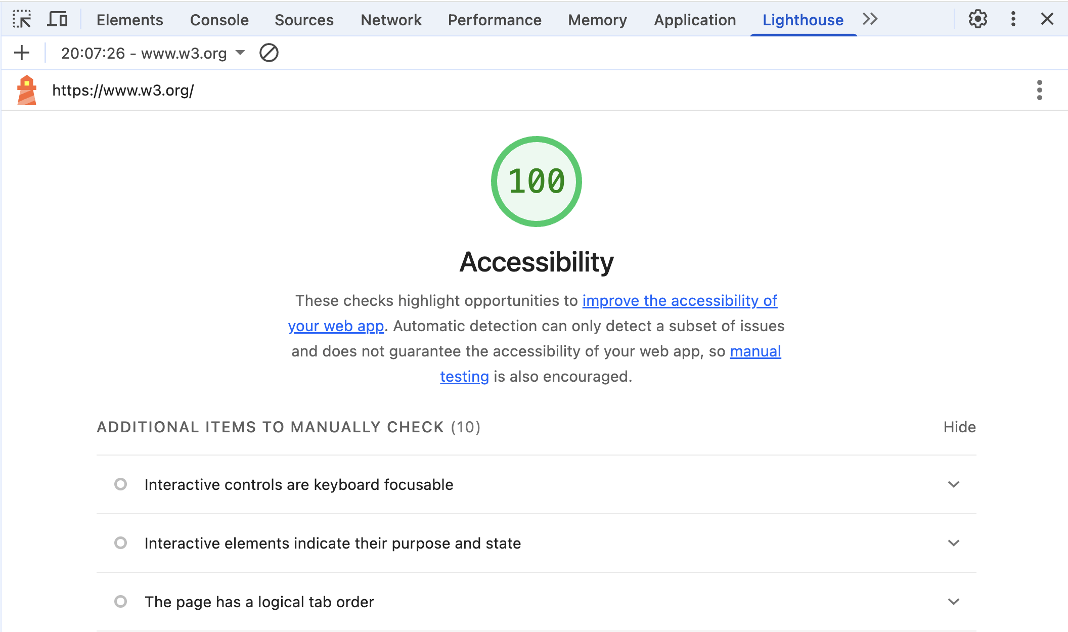
Access Lighthouse with Chrome: Dev Tools > Lighthouse > Generate Lighthouse report
Lighthouse is already integrated into Chrome and Edge and offers a good initial overview of the status of your application.

Important: Getting a score of 100 does not mean that the application is actually accessible. However, this tool is very well suited for basic requirements, such as ensuring that every image has an alt attribute. Lighthouse not only indicates which criteria have been passed, but also which ones still need to be manually retested; so it is a very good starting point.
Accessibility Tree
Access the Accessibility Tree in Chrome: Dev Tools > Elements > Accessibility > Enable full page accessibility tree > Reload > Accessibility Icon
Many browsers offer the option of displaying the accessibility tree in addition to the DOM. This is a good way to understand what information ATs pass on to their users. You should be aware that the accessibility tree can vary depending on the browser.

For an even more immersive experience, Mac and Windows users can also use the screen readers VoiceOver and Narrator, which are integrated into the operating system. However, there are also many open source screen readers such as NVDA that are equally suitable for testing.
Other useful functionalities
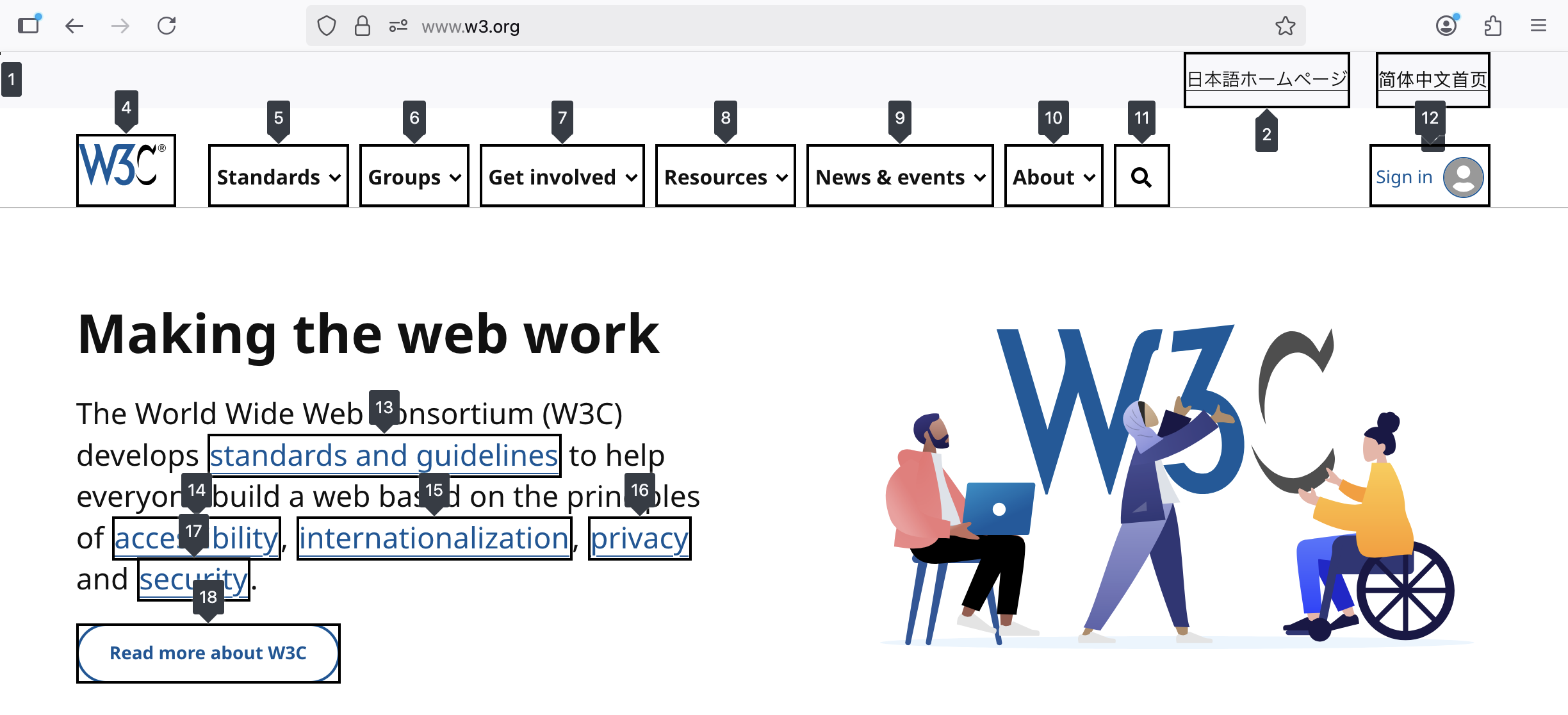
Access tab order with Firefox: Dev Tools > Accessibility > Show tab order
Firefox also offers a feature that is well suited for evaluating keyboard navigation: displaying the tab order. This can be used to ensure that the order makes logical sense; it also allows you to see at a glance whether all interactive elements are accessible via keyboard.

Conclusion
As demonstrated in this guide, most accessibility requirements are not too difficult to implement once you are aware of them. Many objectives can already be achieved through small, consistent changes during the development process like using semantic HTML. Having an accessible web application is therefore very much feasible from a technical position.
Efforts to improve accessibility will also most certainly be rewarded from a business viewpoint: Providing accessible web applications will lead not only to a better user experience for existing users, but also grant access to a completely new base of potential customers – which of course is something to always strife after.
